Ten years of racing, and a brand built to match.
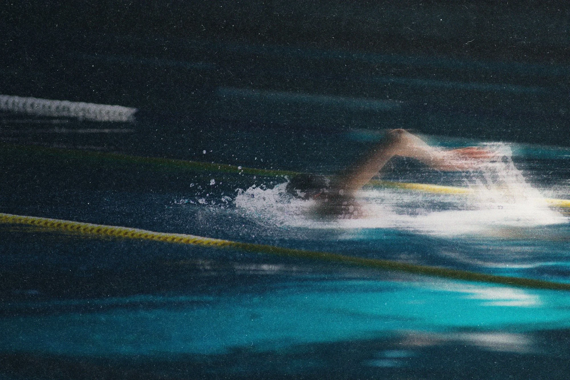
The Sioux Falls Swim Team is a USA Swimming-affiliated youth competitive club entering its 10th year. Edgewise spotted the opportunity while volunteering at a three-day meet and decided to make the case. The pitch: a full visual identity system, delivered at no cost, built around a mark the team could actually own.
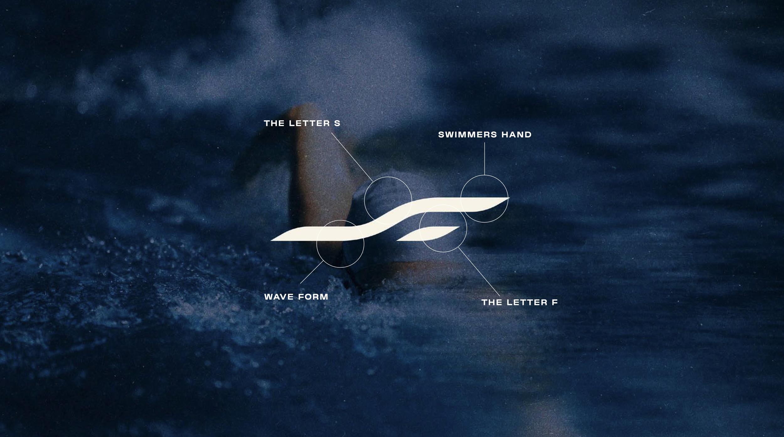
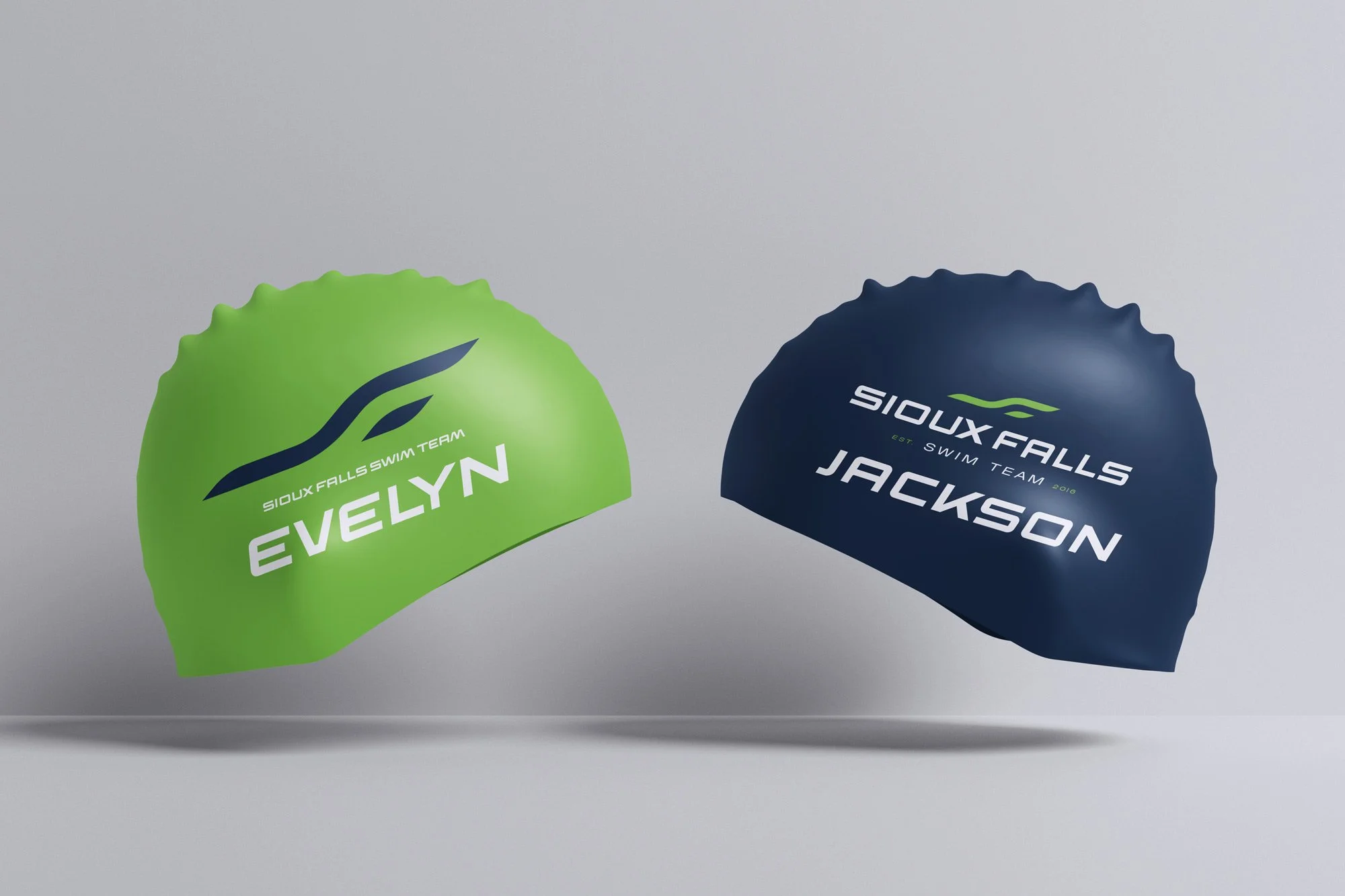
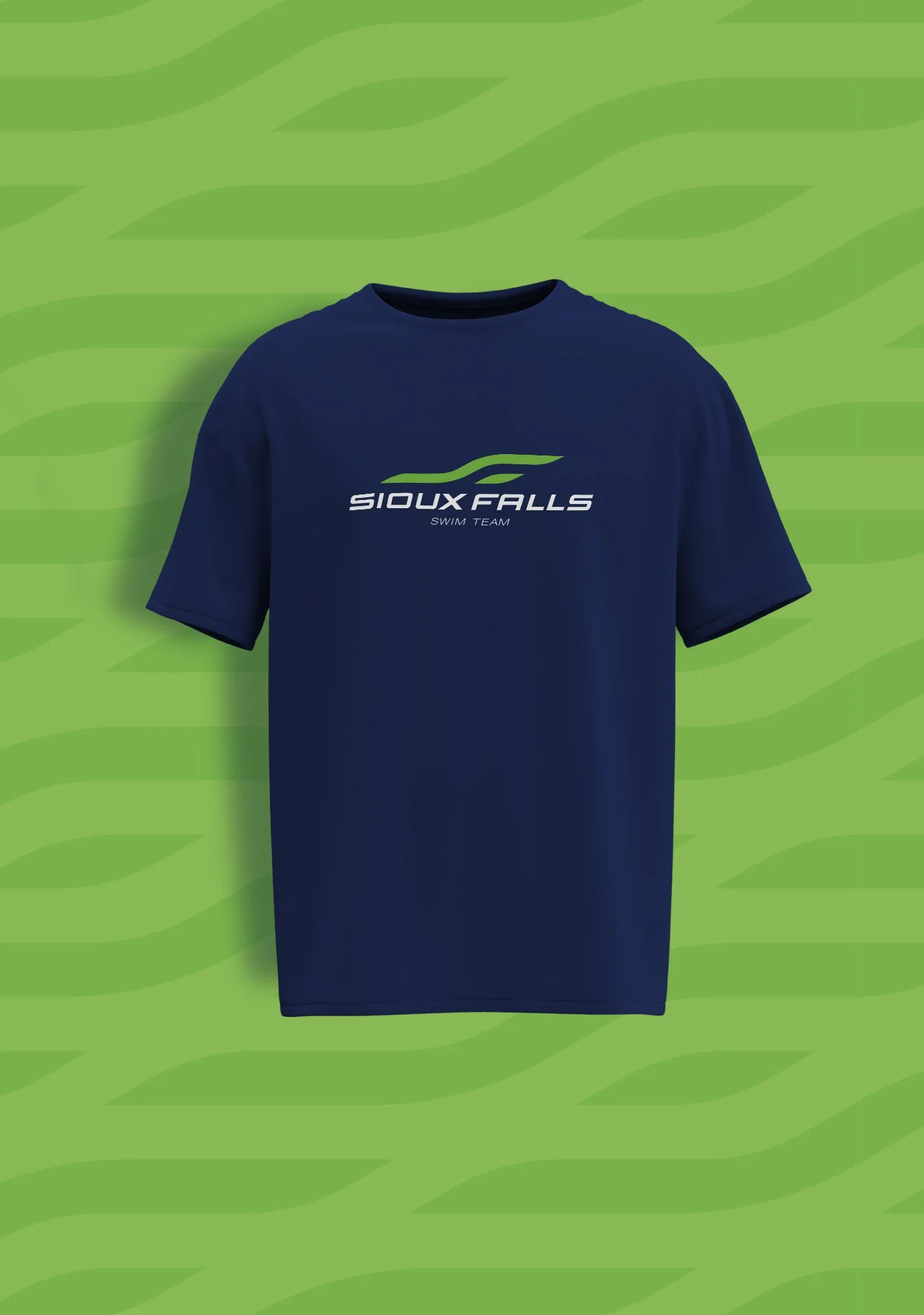
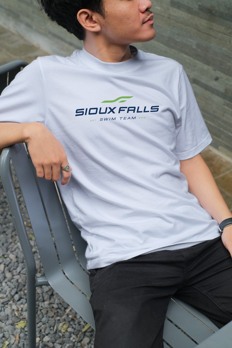
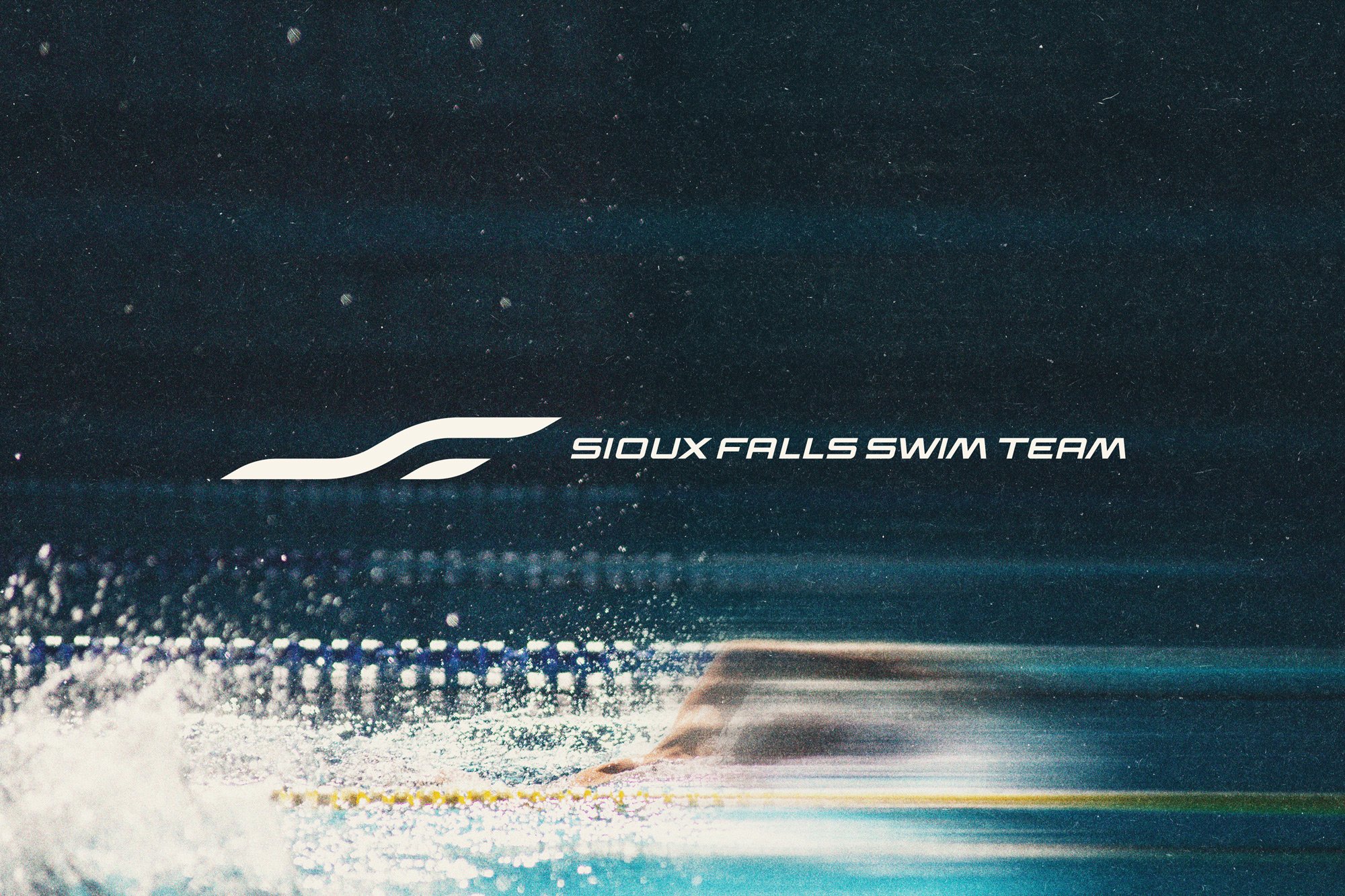
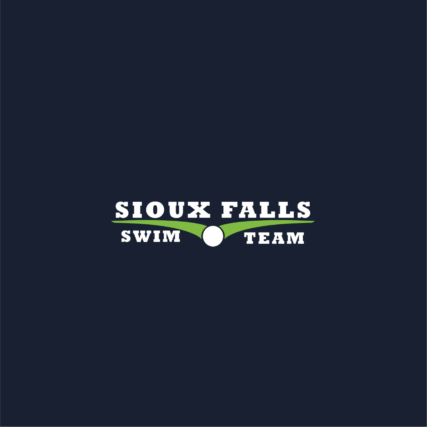
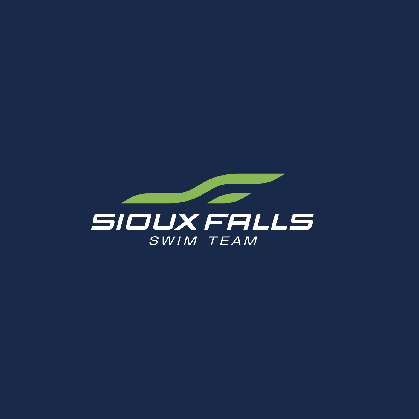
The existing logo read as a bird, not a swimmer, and you could swap in any team's name and it would still work. That's the wrong kind of versatility. The new mark fixes both problems. A two-line abstract form that reads as the letters S and F, a wave, and a swimmer's hand mid-stroke. Sioux. Falls. Swim. It couldn't belong to anyone else.
Before
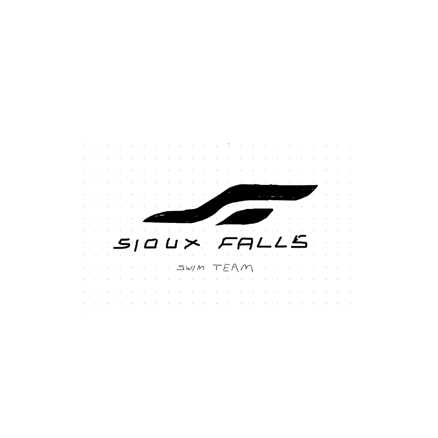
Sketch
After
The concept started as a phone sketch at the meet. By the next day the full package was done. Primary mark, lockups, personalized swim cap mockups, car decal, t-shirts in three color combinations, and a website mockup. When a mark is strong, everything downstream gets easier. Nothing had to be forced. The mark did the work.